My magazine attracts it's audience through style, content, images, colour scheme, and more. My magazine is a serious music journalism magazine, it relies mostly on the content of the magazine to attract the audience, however the appearance of the magazine does contribute to making the audience buy the magazine. Through the use of images and colours I tried to attract the audience to the magazine and make them interested in the content of the magazine. People would want to purchase my magazine because it both informs and entertains the audience, it gives the audience information about gigs, reviews, and upcoming artists. The target audience for my magazine are obviously people that are interested in these topics, and so these people would find my magazine useful, and would want to be associated with it.
For example, on my front cover the main image consists of a man playing a guitar, this is relatable to the audience, as most of the audience are music enthusiasts that have similar demographics to the person on the cover. They see the person on the cover as someone similar to themselves, and so want to learn more about the content of the magazine. The cover also contains information about the articles inside the magazine, I decided to include a couple of stories about popular artists and also to include a review section as this is quite conventional of a music magazine and so will hopefully increase sales.
Another example of how I attracted my audience was through the use of a logo, (The X-Factor), the audience recognise the logo and so are instantly interested in the story. Although it is a new magazine, the audience would find something familiar on the cover and consider it to be something they are interested in. The colour scheme on my cover is also used to attract the audience, the colour blue is a relaxing chilled out sort of colour, where as yellow is a more exciting and bright colour. I have used these colours throughout the magazine to keep it consistent and simple. These colours connote that my magazine is quite informal, but still contains the exciting stories that entertain the audience.
The contents page from my magazine has a very clear and neat layout, I decided to do this as I thought that it would make things much easier for the audience to find. The main image that I used on the page is an image that I am very happy with, and I think that it attracts the audience, and helps make the page look realistic and professional.
For my article, seeing as it was a review of a new band I decided to add many pictures to try and attract my audience to the article. The band is not one that the audience are already aware of, so adding many pictures allowed the audience to soon learn a lot about the band. I also included information about when their next gig was to inform the audience of when they can see them, and also as it helps to promote the location of where they are playing.
The language that I used throughout the magazine was quite colloquial, yet very coherent so that the audience could understand things easily.
Throughout the construction of my magazine I asked someone of my target audience what they thought about my magazine, I thought that this was very important to get an opinion on the look of the magazine so that they could tell me how to improve it. At one point, this person told me that they didn't like the colour blue that I used, and so I changed it to suit my audience and to improve my magazine.
Katie Pritchard's AS Media Blog
Looking back at your preliminary task (the college magazine task), what do you feel you have learnt in the progression from it to full product?
From when I did the preliminary task up to the main task, my photoshop skills improved a lot, and I think it shows looking at the college magazine compared to the music one. The music magazine seems to look a lot more professional, and I think that by doing research into other music magazines, and by researching my target audience I was able to create a better and professional looking product that attracts my audience.
I think that the most obvious improvements from my college magazine to the music one were the images, the colour scheme, and the layout. By doing research into other music magazines I learnt many codes and conventions of magazines, and tried to include them in my own magazine to make the magazine look realistic. I learnt about how important images are for a magazine, and so the images in the music magazine are better planned and are more fitting to it's audience. Also, the text in my college magazine is quite difficult to read in some parts, so I learnt that for my music magazine to work better, I had to have a clear layout that would allow the audience to find things clearly and actually be able to read the text.
Specifically, the photoshop techniques that I improved in were text allignment, the polygon lasso tool and feathering edges which I used to cut people out of images, using photoshop rulers and also colour picking. I learnt that by using text allignment, I could make the text look more interesting, and make it stand out against other text on the page, I could also make it fit better in specific areas. By using the polygon lasso tool and by feathering edges, I learnt that I could cut people out of backgrounds a lot more accurately than by using the quick selection tool, and by feathering it I could give the image a softer look against it's new background. I also learnt how to use photoshop rulers to line things up on a page and make the layout look clear and professional to the audience. I also learnt that picking colours is very important in order to attract my audience, and by picking colours such as blue and yellow, the blue is a relaxing cool colour, where as the yellow is a bright colour that excites the audience and makes them want to learn more. These are also two colours (particularly the blue) that would not typically be found on a music magazine, so gives a fresh new flavour that attracts the audience.
What have you learnt about technologies from the process of constructing this product?
I have used many different technologies during this coursework, I have learnt how to use them and developed my skills in them. Here is a list of the different technologies that I used, how I used them and their advantages and disadvantages.
Adobe Photoshop:
I used Photoshop during the construction of my front cover, contents page, and article. Photoshop is a programme that allows you to digitally edit and create graphics. I had used photoshop briefly before this coursework, and had some experience using it, but throughout the construction I have developed my skills and learnt a few new things. I learnt about many tools, such as the polygonal lasso tool, blending options, the clone stamp tool and also the benefits of multi-layering.
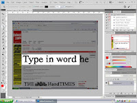
 This is a screen shot I took using the crop tool. I used this mostly when I copied fonts from the website Dafont.com
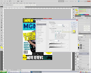 This is a screenshot I took using the blending options, I used these mainly for text, to make the text stand out against the background.
 Digital Camera:
The camera that I used was the Canon EOS 550D, I used this camera to capture the images for my magazine. I used these pictures on the front cover, the contents page and the article. I tried to take as many pictures as I could in many different angles and positions to try and experiment and have a large choice of what pictures to include in my magazine. I took pictures of bands playing, and so experimented with how many people to include in the shot and what angle to take the pictures in.
Blogger:
Blogger is the website that I used to post all of my coursework onto the internet. Blogger was very easy to use, and a useful tool for completing my coursework. The advantages of using this, is that by posting all of my work on here, it allows me to access it from anywhere. I can also add pictures very easily, add to my work whenever I want, and it also made my coursework much more interesting to do. Writing an essay on Blogger was a lot more entertaining than simply writing it on paper, or typing it up and printing it out. It also allows all of my work to be in one place that I can organise, access easily, and compare quickly and easily. However, I found that using Blogger was quite limited in terms of design, and more formatting would allow me to make my blog more creative and to my own style.
Flickr:
Flickr is a website used to upload and share pictures, I used it to upload my pictures and link them to my posts on my blog, I also used it to analyse many magazine covers for my research. Analysing things on Flickr is very simple and effective, I can target a specific area on the image and write a caption, which allows me to analyse small parts of the image rather than the entire image and risk leaving out important details. It is much easier than writing an essay as it is very interactive.
Dafont.com:
Dafont is a website that shares many different fonts, it allowed me to copy fonts I thought were fitting to my magazine, and add them to my work. There are hundreds of fonts on there, and the fonts are much better than those provided on Photoshop. However, a disadvantage was that because I am using the college network I could not download and install the fonts, so any fonts I used had to be screen shots off the website. Making it very difficult to write longer sentences using any fonts on the website.
Who would be the audience for your media product?
Demographic categories: The marital status would most likely be single due to the age group of my readers, but for older readers could also be married. The social status of the readers would probably be in groups A, B and C1; but my audience could also be anyone that appreciates the indie style genre of music. I think my price of my magazine is very fitting for my audience, it is quite cheap and because it is a weekly magazine it is likely that my readers will be quite loyal to the magazine, especially at the price.
Psychographic categories: The majority of readers will probably be Individuals. They will probably be passionate about music, and many interested in taking a music qualification. The readers would enjoy attending concerts and gigs, and appreciate music.
Lifestyle Subsets: Most readers are probably students, but could also include young people with a part time job, or a full time job. The reader will attend many gigs, concerts, music events etc, and may even be involved in music personally, such as being in a band. The readers are young males, and so probably enjoy a good time, and spend a lot of time going out.
My target audience would listen to indie style music, this could include anything from Lily Allen to Mumford and Sons. Many of the audience will not have many responsibilities, and so can afford to spend their money on themselves, they will probably buy lots of clothes, food, have a contract phone, and very likely will have an iPod. They would watch TV problems such as Hollyoaks, Friends, The Simpsons, and Skins.
In my magazine, products such as Pepsi, hair products, and HMV would probably be best to advertise in my magazine. These are products my audience would use.
My audience would buy my magazine as they are interested in the music scene, they like to keep up to date with upcoming bands, and also what is going on. They also like attending gigs and so would use the magazine as a gig guide.
My audience would buy my magazine as they are interested in the music scene, they like to keep up to date with upcoming bands, and also what is going on. They also like attending gigs and so would use the magazine as a gig guide.
What kind of media institution might distribute your media product and why?
I am competing against NME magazine, so IPC is not an option as they publish NME and the magazines would be too similar. I would need a large publisher that would be able to compete with IPC, such as Kerrang publishers Bauer. Bauer and IPC are rivals.
The advantage of going with a big company such as IPC or Bauer is they are a well-known and respected publisher; they also have good resources and are in contact with retailers that stock magazines. They publish many different magazines, and it is unlikely that they will be short of money, and so could spend a lot of money advertising a new magazine.
The disadvantage of being a large company is one particular magazine may be ignored compared to others, the most successful magazines will receive all attention and focus, but limited work will be put in to improve less popular magazines. Also, it may affect my magazines editorial independence, and the focus of my magazine will be less on the audience, and more on advertisers to maximise profits.
It is important for my magazine to both promote itself, and to work in synergy with other brands. For example, my magazine could work in synergy with iTunes and produce updates from celebrity ‘Ping’ accounts to its readers, and inform iTunes of upcoming bands/artists.
How does your media product represent particular social groups?
The audience for my magazine, are males between the ages of 17 and 30, my audience are music lovers, and appreciate it in different ways. Many go to gigs and live concerts, and regularly check online for the latest news and event information. The music my audience listen to is most likely to be indie style music, and they also enjoy learning about upcoming bands. My audience don’t appreciate mass market music, and have an individualistic style. Due to their age, the audience will probably be single, and their social status will be in groups ABC1.
The psychographics for my magazine are that the majority of readers will be individuals, be passionate about music, and whom a lot will enjoy attending concerts. Their lifestyle will include being students, attending gigs, they may have a part time job, some may even be involved with music personally, such as being in a band, and they will probably enjoy going out and having a good time.
Similarities
- Both are holding a guitar
- Intense expressions on their faces
- Similar hairstyles
- Both aren't looking directly at the camera
- Similar postures- both holding a guitar
- Both represent an audience of young white males
- Different lighting
- The one on the right is a long shot, and you can see their entire body
- The one on the left is a low angle shot
My magazine has a pro-consumerist stance; any products that are advertised in my magazine will both earn money and encourage my audience to buy certain products. My magazine is a great way for advertisers to target a specific audience and to create brand awareness of their products. Also through the use of advertising I can increase the income of the magazine considerably.
In what ways does your media product use, develop or challenge forms and conventions of real media products? (continued)
An analysis of my article page for my magazine.
(Click image for labels on Flickr)
(Click image for labels on Flickr)
In what ways does your media product use, develop or challenge forms and conventions of real media products? (continued)
An analysis of my Contents page for the Magazine.
(Click for labels on Flickr)
My contents page is quite conventional, it contains an on the cover features section and a regulars section which are typical for this type of magazine. However, the layouts of contents pages can be very different, and so I decided to use this clear simple layout that allows the audience to locate information quickly and easily. I also have used four pictures to try and attract my audience to particular articles in the magazine.
In what ways does your media product use, develop or challenge forms and conventions of real media products? (continued)
This is an analysis of my Magazine
(Click image for labels on Flickr)
My front cover is quite conventional of most music magazines, it contains many of the main features of a front page, but does still have a unique style compared to other covers. The main image is not very conventional of music magazines as the artist is not looking directly into the camera. My magazine however, is for an individualistic audience and so does not have to follow all conventions.
In what ways does your media product use, develop or challenge forms and conventions of real media products?
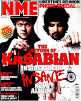
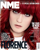
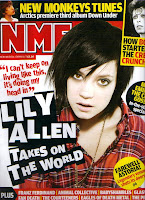 Most magazines follow a standard sort of format, and include conventions that are typical for that genre of magazine. Depending on the genre of the magazine, some might be more conventional than others. Conventions allow the audience to identify aspects of the magazine very easily, as it is a layout that they are used to, and see every day.
 Magazine covers contain many conventions such as;
- A masthead (usually the name of the magazine located at the top of the page)
- A selling line (something to encourage the audience to buy it)
- A dateline (the date of the issue)
- A main image (to attract the audience)
- Cover lines (to tell the audience what the magazine contains)
- A bar code (retail purposes)
- A main cover line (the most important cover line, usually larger and more exciting than the rest)
Magazine Article pages also contain typical conventions such as;
- Pull quotes (interest the reader to the story)
- A kicker (small paragraph giving information about the article)
- Gutters (space between the texts)
- Body text (the main article, usually laid out in many columns)
- A caption (something to explain an image)
- Drop cap (The first letter of the article is larger than the rest)
- Sidebar (giving additional information)
The genre of my magazine is an indie music magazine that includes serious music journalism. Many of the influences for my magazine came from NME magazine, which is a magazine of a similar genre.
My Own X-Factor logo
For my magazine cover, I included a a coverline about the X-Factor. I wanted to include a picture with this particular story to attract the audience and so decided to create my own X-Factor logo. As you can see on the right, the picture in the top left corner is the original logo, and the picture lower down is my replication of that logo.
Props, Cast, Setting, Location Report for Magazine
I am planning to use natural pictures on my magazine, I am going to take pictures of live performers as I think it will relate, and attract my audience more. The people I will use in my images will be actual bands/artists, as I plan to write my article on a particular event organiser; The secret handshake club. I will attend as many of these events as I can, and take pictures of the bands playing. The first gig that I went to was one at the Lowestoft football club.
Mood Board for my magazine
This is a mood board for my magazine, it gives a representation of the type of audience my magazine will be aimed at.
The target market for my magazine are males between the ages of 17 and 30.
My target audience appreciate music in different ways, many go to gigs or live concerts also many of the readers like to keep up to date with news, and regularly check the internet.
Readers of my magazine are likely to be males that enjoy indie style music, and whom also appreciate listening to new bands. My readers don't appreciate mass market music, but like to stick to their own style.
My typical reader:
Male 72%
Female 28%
Average age 25
ABC1 73%
Demographic Profile
The age of the audience for my magazine is between 17and 30. The gender for the magazine is primarily males. The marital status would most likely be single due to the age group of my readers, but for older readers could even be married. The social status of the readers would probably be in groups A, B and C1; group A being upper middle class people, who higher managerial or are professionals. Group B being the middle class, intermediate management or a professional, and group C1 being lower middle class, supervisory and junior managerial or professional.
Psychographic Profile
The majority of readers will probably be Individuals. They will probably be passionate about music, and around 50% are interested in taking a music qualification. The readers enjoy attending concerts and gigs, and 80% say that music is an important part of their lives.
Lifestyle Subsets
Most readers are probably students, but could also include young people with a part time job, or a full time job. The reader will attend many gigs, concerts, music events etc, and may even be involved in music personally, such as being in a band. The readers are young males, and so probably enjoy a good time, and spend a lot of time going out.
In my mood board, I included many images to represent the type of people who this magazine targets, I included the shops that the audience may shop at, the food they might eat, the products that they might use, and just general information about the type of person, what they wear, what they look like, what they watch, how old they are etcetera
Subscribe to:
Comments (Atom)


